
What Substack's Analytics Aren't Telling You
Why Your Newsletter Needs a Better Map and How to Read It

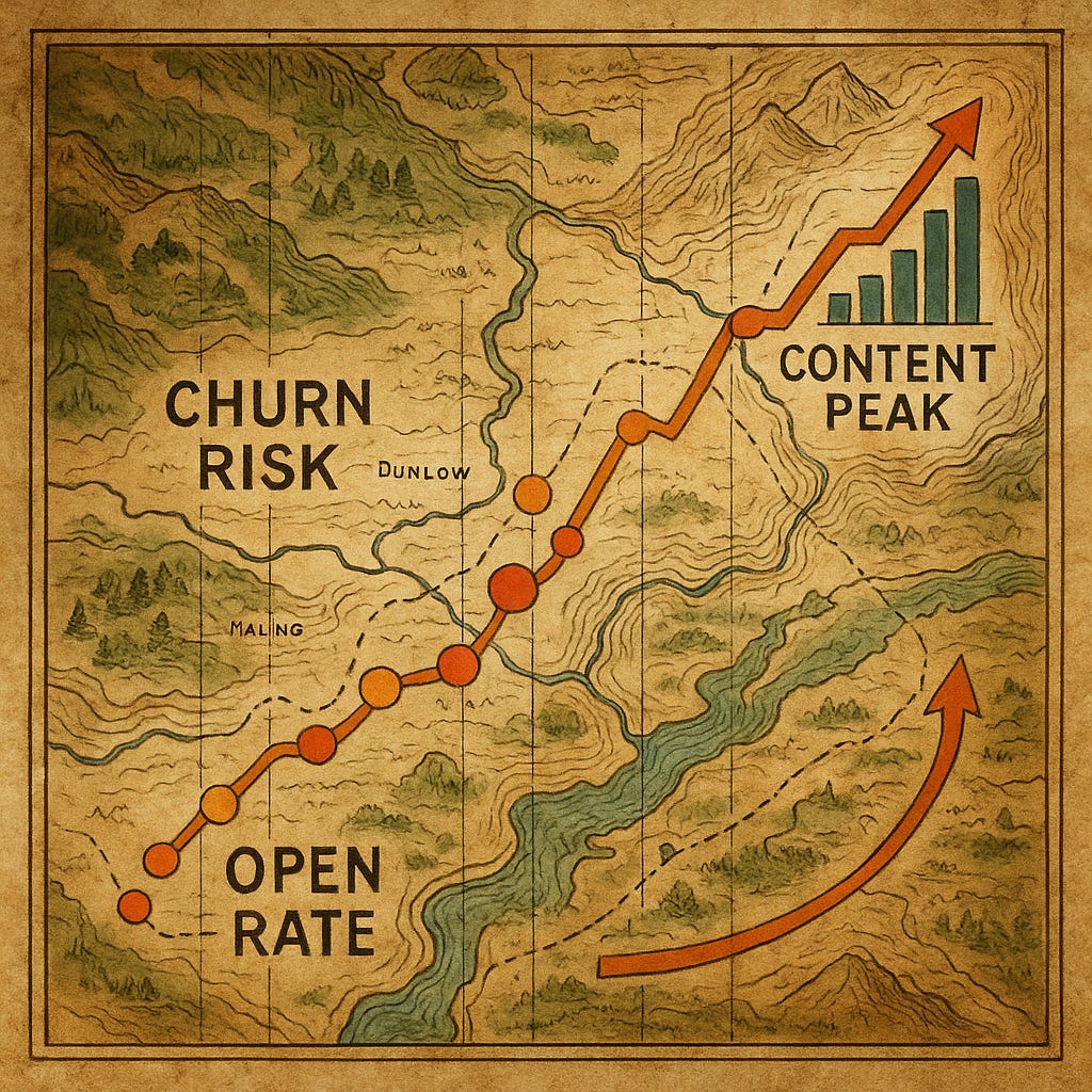
Lost with the Wrong Map
My wife and I have been digital nomads since 2022, living for months at a time in countries across Europe.
Early on, we learned a hard lesson about navigation. In unfamiliar cities, we relied on Apple Maps and often ended up lost down narrow alleys or facing unexpected dead ends.
Frustrated by wrong turns, we switched to Google Maps and immediately felt the difference – having the right map makes all the difference.
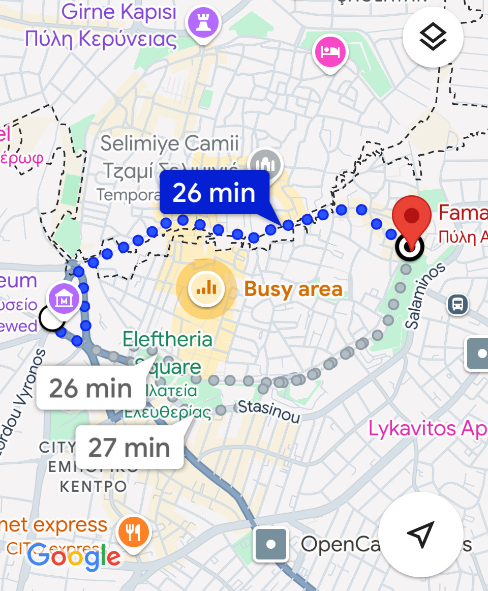
But Even the Right Map Can be Misread
Once, while wandering through Nicosia, Cyprus, we followed Google’s walking directions toward what looked like a normal street. As we got closer, we realized we were approaching a dotted line on the map – the kind you usually ignore.
Suddenly, we stumbled upon a border crossing! (Turkey occupies the northern part of Cyprus, including part of the capital city.)
We hadn’t intended to leave the country that day, but there we were at a checkpoint.
The Newsletter Map
In the world of newsletters, reading analytics can feel like navigating a strange city. Many Substack writers obsessively check the basics on their dashboard: open rates, subscriber counts, maybe the number of likes or shares. These are your maps.
But if it’s the wrong kind of map (or an incomplete one), you’ll miss the turn-offs and borderlines that matter.
Relying only on Substack’s default analytics is like navigating a complex city with a simple tourist map. You see a few big landmarks, but miss the critical details.
And risk taking some wrong turns with your strategy.
The Limits of Substacks’ Basic Metrics
Substack provides a solid starting set of numbers. On your dashboard, you can find your total subscribers, recent growth, post views, email opens, likes, and even the number of new subscribers each post brought in.
Those are important “landmarks” – much like the famous monuments on a city map.
However, there are significant blind spots in these basic metrics that can lead you in the wrong direction:
No early warning for churn: Substack doesn’t tell you which subscribers are fading away. You usually find out someone churned after they unsubscribe. There’s no alert for “hey, these 50 people haven’t opened an email in two months.”
No identification of conversion-ready readers: Who among your free subscribers is most likely to upgrade to paid? Substack’s default tools won’t highlight your superfans. You can see overall open rates, but not a list of “these 10 people who always open and click.”
No link between content and outcomes: While you can see per-post views and some subscriber gains, it’s not clear which content truly drives your business goals. You can’t tell whether your in-depth tutorial brought in more revenue than your personal story, or vice versa.
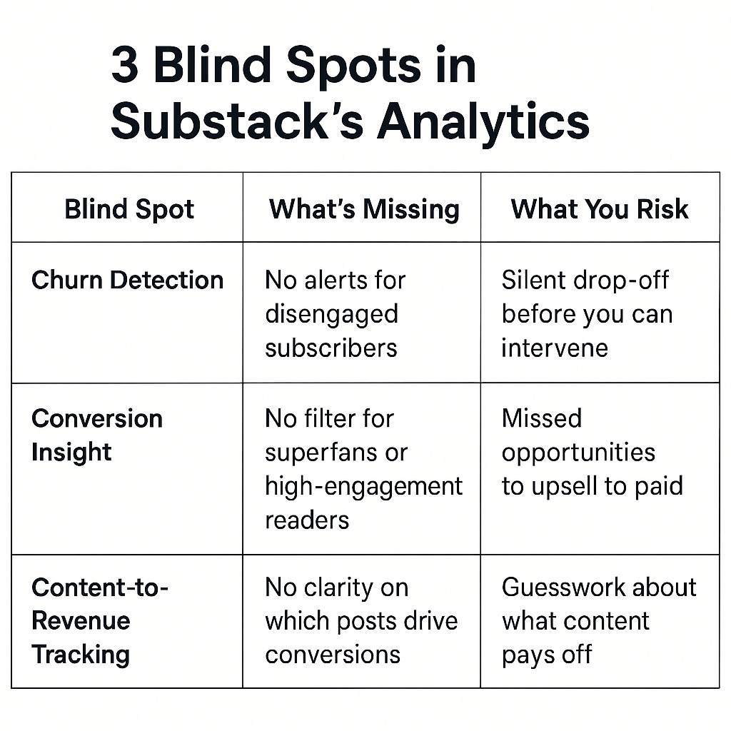
In short, the default map of data has big holes.
So, how do we fill them?
By drawing a more detailed map.
Digital Cartography – Mapping Your Newsletter Data Landscape
Think of advanced analytics as digital cartography for your newsletter. It’s the process of mapping the landscape of your audience data in detail.
Instead of just seeing “open rate: 45%” as a single number, you map out which readers open most and which rarely do. Going beyond the surface to chart things like:
Engagement territories: sections of your audience and content where engagement is especially high or low.
Conversion pathways: the typical routes by which a casual reader becomes a paying subscriber (maybe they read 5 free posts, then a particular article convinces them to upgrade).
Risk regions: warning signs in your audience (e.g., longtime subscribers who suddenly stop opening emails).
Opportunity zones: untapped potential, like an audience segment that loves one content type that you could offer a paid product for.
It might sound abstract, but in practice it’s about using the data you already have (emails, opens, clicks, subscriber history) and overlaying it with insight, much like how a topographical map shows you not just the roads but the elevation, the rivers, the forests. You get a richer view of the terrain. And a richer view means better decisions.
To illustrate, let’s navigate three key “landmarks” on this data map that every newsletter author in the 200–1000 subscriber range should be watching.
1. Dormant Subscriber Territory
Spotting At-Risk Readers
The first analytics move every Substack writer should make is to identify dormant subscribers, especially dormant paid subscribers. These are people who were once active but have quietly stopped engaging. In this territory lie your highest-risk cancellations. After all, most subscribers don’t wake up one morning and randomly hit “unsubscribe.” Churn is usually the end of a gradual disengagement journey.
Common signs you’ve entered the Dormant Subscriber Territory include:
Decreasing open frequency: A reader used to open every email, but now they open one in three.
Delayed opens: They used to read your emails immediately after publishing; now, they sit in their inbox for days.
Partial reads: They aren’t reading to the end anymore.
🧭 Pro Tip #1: How to Spot Churn Risk in Google Sheets

Substack won’t flag disengaged readers, but you can build your own early warning system.

Step One: In your subscriber dashboard, click the three dots in the top-right corner. Choose "Export," then select "Export all columns" and download the .csv file.

Step Two: Import the file into Google Sheets.

Step Three: Sort or filter by the “Email Last Opened At” column.

Step Four: Add a column to flag subscribers who haven’t opened in 30–60 days.

Bonus: Use conditional formatting to color-code churn risk at a glance.

In minutes, you'll have a simple visual dashboard showing who’s quietly slipping away—before they unsubscribe.
2. Superfan Highlands
Finding Your Conversion Gold Mines
On the flip side of the disengagement zone is a very exciting place: what I call the Superfan Highlands. These are the peaks in your audience – the readers who can’t get enough of your content. Every newsletter has a subset of subscribers who are deeply engaged. Identifying them is like finding veins of gold in your mountain – they are your best candidates to become paid supporters (or to buy whatever you offer next).
Signs you’re in the Superfan Highlands:
They read everything: Long posts, short posts, off-schedule posts – a superfan doesn’t miss a beat. If you experiment with a new format or send a surprise email, they’re the first to open it.
Multiple touches: Perhaps they open the email, and click through to read on the web, and even read it again later. Maybe they read on their phone, then again on their laptop. That indicates the content resonated enough that one read wasn’t sufficient (or they wanted to digest it fully).
They engage beyond reading: These are the folks who leave thoughtful comments, hit the “like” button, share your post on Twitter, or even email you replies. They may also follow you closely on Substack’s Notes or other platforms.
They dive into archives: A superfan who discovered you recently might go back and read a bunch of your older posts. If you suddenly see older posts getting views, that’s often a superfan bingeing on your content library.
🧭 Pro Tip #2: Identify Your Superfans

Want to know who’s most likely to convert to paid—or who deserves a personal thank-you?

Step One: In your subscriber dashboard, click the three dots in the top-right corner. Choose "Export," then select "Export all columns" and download the .csv file.

Step Two: Import the file into Google Sheets.

Step Three: Sort by the “Emails Opened” column to find your most active readers.

Bonus: Look for long-time free subscribers who stay highly engaged—that’s upgrade potential.

You’ll uncover the core audience who’s already leaning in. These are your newsletter’s true believers—and your best bet for paid conversions, feedback loops, or early access offers.
3. Content Impact Valleys
Unearthing Hidden Gems in Your Posts
Not all content is created equal. Some of your posts will soar (high open rates, lots of shares), and some will flop – that’s normal.
But there’s a tricky phenomenon I’ve noticed in my data: sometimes a post that looks like a flop initially can turn into a quiet success over time. If you’re only watching the immediate metrics, you’ll miss it.
I call these the Content Impact Valleys – low spots that eventually reveal an upward slope.
Let me share a quick personal story. In my travel newsletter, Zigzag Along, my wife once wrote a heartfelt piece about a 70-year-old woman we met on the island of Corfu. This woman happened to be the granddaughter of a local folk hero, and we even took a selfie with her.

We loved the story, but when we published that issue, the email open rate was disappointingly low. Honestly, I thought that post didn’t resonate, and I mentally filed it under “oh well, they can’t all be hits.”
Now fast-forward a month. I’m testing some of our new Stack&Scale analytics tools. I look at the past 3 months of post-performance, and I nearly spit out my coffee. That Corfu story? It had become our third-highest viewed post ever!
How on earth…?!
It turns out, over the weeks, many subscribers who hadn’t initially opened it went back and read it later. Perhaps via the archive or because I mentioned it in a follow-up. Plus, some folks shared it around because of the unique story, and new readers checked it out.
The lesson for me was huge: you don’t always know right away what content is working best. Some posts need time to “bake.” If I had only looked at the first 48 hours, I’d have dismissed that article as a miss. The deeper analysis showed it was a slow-burning hit.
Turning Insights into Action
At this point, you might be thinking, “Okay, great – identify who might leave, find my superfans, analyze my posts over time… but what do I actually do with all this?”
The real power of analytics comes when you act on the insights. A detailed map isn’t useful if you don’t plan a better route, right?
Here are a few strategic moves you can make once you have this richer data map of your newsletter:
Launch a retention campaign for at-risk subscribers: Remember those at-risk readers in the Dormant Territory? Don’t wait for them to churn! Set up a simple win-back email sequence or personal outreach.
For example, send a gentle note along the lines of “We miss you – here’s what we’ve been up to in case you’d like to catch up.” Highlight a few recent posts they might like.
Nudge your superfans toward conversion: Take that list of highly engaged free subscribers. These folks deserve VIP treatment. Consider a special offer or just a direct ask: “You’ve been reading us for a while – if you enjoy this, we invite you to support us and get a discount.”
You might give them a promo code or discount for the first year of paid, as a thank you for being loyal. Or invite them to a live Zoom call or AMA for subscribers – something that makes the value of upgrading clear and enticing.
The big picture: Newsletter growth isn’t just about getting more people in the door. It’s about understanding the people you already have – seeing the full map of your audience’s journey – and making informed moves to keep them happy and bring them closer to your goal (whether that’s paid subscriptions, course sales, Patreon support, etc.).
When you have that complete picture, you’re no longer navigating blindfolded.
You know where the winding paths and hidden bridges are in your audience, and you can lead your readers (and yourself) to where you want to go.
Your Data Map, Done for You
By now, the advantages of deeper analytics are clear, but you might also feel a bit overwhelmed. Mapping data, exporting CSVs, spotting patterns… it can sound complex or time-consuming, especially if you’re already writing every week. The good news? You don’t have to do this alone or build tools from scratch.
This is exactly why I founded Stack&Scale.
I’m a data nerd at heart. I love uncovering the hidden stories in subscriber data. I want to make it simple for other writers to do the same. We’ve built an AI-powered analytics service for Substack writers in the 200–1000 subscriber range (yep, right where you are).
What do we do? We take your Substack data (with permission) and run it through advanced analytics, the kind big companies use, tailored for indie creators. Then we hand you a report full of actionable insights: who’s fading, who’s engaged, what’s working, and where your best growth paths lie.
But we don’t just dump data—we give you strategy. Our goal is for you to walk away feeling clear and confident about what to do next.
Right now, you can get our Comprehensive Substack Accelerator Analysis for just $149 (beta pricing). You'll receive your complete analysis within three business days, including:
Comprehensive 5-7 page analysis of your newsletter metrics
AI-powered growth recommendations
Subscriber engagement patterns and opportunities
Content optimization strategy
Custom re-engagement plan for at-risk subscribers
30-minute consultation to review findings
If you’re ready to stop wandering and start navigating your newsletter with precision, let’s do it.